Chen, Yi-Lin

RockX
Music Museum AR Tour | Mobile App

Introduction
RockX is a school project allowing museum visitors having immersive experiences for exhibition exploration. It's team project of 3 while I was in charge of the B2C mobile app which can fit all kinds of using scenarios, including
1. Walk-in users (without ticket and plan)
2. Semi-scheduled users (with either plan or ticket)
3. Fully-scheduled/experienced users (with both ticket and plan).
Problem
-
The museum is huge and visitors can easily get lost without instruction.
-
Users visit with different levels of preparation (pre-scheduled vs spontaneous).
-
On-site virtual store: Visitors can only shop online AND on-site. (pick-up station is available)
Tools
-
Axure
-
Figma
-
Miro
My Role
-
Define Persona
-
Build up Journey Map
-
UX Design for B2C mobile app
Solution
-
Build navigation in the AR mode.
-
Setting ticket and plan mandatory tasks for users. Customized plan can be retrieved easily by quick questionnaire, especially for spontaneous visitors.
-
Promote related information based on user's selection.
Teammate
-
Vishaka Joshi (B2C web app)
Timeline
-
08/2023~12/2023
Persona
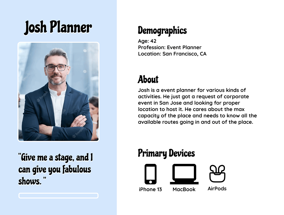
To form a deeper understanding of our users' goals, needs, experiences, and behaviors, 3 personas from different age segments were created. The goal of setting up persona is to clarify the pain points from different generations which will be focused for developing design solution later on.
Tool used: Figma


Journey Map
To thoroughly think through the needs and paints during accomplishing goals in each stage, User Journey helped to clarify the feels, thoughts and actions from users. Through this process, we found that "Music" is a key element for achieving an immersive experience other than vision. Hence, the interface of music control is necessary. Also, navigation in the museum to planned and unplanned destination is definitely useful for visitors who are not familiar with the place.

Conceptual Model
To build up Conceptual Model, I firstly defines the grammar though dense Object-Action Matrix and Object-Attribute Matrix. Later on, to make common task "easy", Priority Matrix was used to evaluated the "common" level by two dimension, frequency (how often) and volume (how many).


Task Flow
The goal of the flow design is to minimize the number of steps and screens and make the decision path choices clear. There are 2 task flows concluded, one for retrieving tickets and plans, and the other for Operation in AR mode.
Tool Used: Miro

Sketches
I began the design process with low-fidelity sketches to accelerate decision-making through visualization without losing time. The sketches were based on the objects (A), actions (B) and the status of a visit (C). As the result, option A provide more intuitive operation since AR should be the key feature being emphasized. The later on layout of each screen follows the arrangement of the sketch.

Final Design
Home Page
Ticket
I lay the Ticket section on top because it is the first task users need to complete before entering the museum. Once the entry ticket is retrieved or purchased, it will be displayed on the top of the screen which is convenient for users for entrance check. Meanwhile, the available workshop or event ticket on the same day of visit will be visible right next to the entrance ticket which is beneficial for promoting events.
Plan
In such a large scale museum, having a plan before visiting is strongly recommended. Considering walk-in users not having any plans, they are able to quickly select a plan package automatically generated from the system, such as most-popular or old-but-gold. Otherwise, users can tailor the plan through taking a questionnaire.
AR Button
The system can sense user's location. The AR button will be activated when the system detects users entering the exhibition zone.
Without Ticket/Plan
With Ticket/Plan


AR Feature
To differentiate from non-AR pages in retro red, the theme color for AR screens will be changed to retro yellow. Users will mainly receive yellow interfaces to imply that they are in AR feature. There are two main modes in AR feature: Guide mode and Learn mode.
Learn Mode
In the Learn mode, users will be virtual options on the screen. Users can freely click on any of them and related content will be displayed to users. The available content includes pictures, videos, descriptions (in words and sounds) and merchandises.
Guide Mode
The Guide mode can quickly help users understand where they are and where to go. Once clicking on the Guide button, users can choose planned exhibitions or any other facilities on the map like restrooms or elevators for navigation. Once setting up destination, there will be an arrow on the screen navigating users to the designated place. Just follow the arrow and the system will notify to end navigation once arrival.
Music Player
To enhance immersive experience, music will be automatically played once getting into AR feature. From the music player at the button, users can easily switch the music and adjust the volume. If users find any song attractive, user can quickly save it through the bookmark in the corner. To avoid users spending too much time on playlist, I don't give the option to scrub the songs. In this case, users are expected to put more attention on exhibits and AR content.
Learn Mode


Guide Mode


Prototype

Learnings
Working in the field of Augmented Reality (AR) has been a fascinating journey. AR experiences are continuous and dynamic, but they can be interrupted by various factors, such as unexpected phone calls or the need for a restroom break. Therefore, during the design process, I focused on anticipating potential interruptions and ensuring a seamless return to the AR experience.
To address this, I introduced a feature—a tiny tracker on the home page. This tracker allows users to easily pick up where they left off, even if they temporarily exit the app. It ensures a smooth and uninterrupted experience for users.
In addition to the visual aspects of AR design, I also paid close attention to auditory elements. I aimed to immerse users in the AR experience by providing corresponding music. The music player was designed to play different types of music based on the theme of the exhibition users were visiting. To keep the focus on the exhibition content, I made a deliberate decision to remove the scrub bar from the music player, encouraging users to concentrate on the experience itself.
Furthermore, I considered accessibility as a key aspect of my design. Recognizing that some individuals may have difficulty reading long paragraphs, I implemented an audio guide. This guide presents the sentences in a larger, bold font, enhancing accessibility for a wider audience. I'm eager to test and refine this feature to ensure an optimal experience, including determining the ideal speech speed and the appropriate content length for each section.
In this way, my work in AR design has been driven by a commitment to user satisfaction, incorporating solutions that enhance the user experience and accommodate a range of needs and potential interruptions.
More Projects

HelpYourCELF

Transit

Twitch on Apple TV